Chapter 5: Typography in Web Design – Serif & Sans Serif Fonts, Typography as Art.
September 6th, 2011
Serif and Sans Serif Fonts
Serif fonts such as Times, Georgia or Baskerville are used for large bodies of text as they are more distinctive, familiar and legible. Whereas Sans Serif fonts such as Ariel, Helvetica and Verdana etc. are more effective for low monitor resolutions and therefore applied to captions, headlines and logos. Serifs are distinguishable from Sans Serifs because they have small lines or hooks on the end of characters.
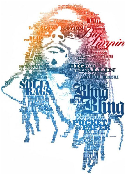
Typography as Art
Typographic art, is typography at its most creative. This is the culmination of space, size, effects, contrast, colour etc. that goes into every aspect of design involving the use of type. Designers not only use type as an effective means of embracing aestheticism but also to convey important messages.
(Tredhunter)
Remember these are not rules, they are merely guidelines. Thus, the fundamental constituents of typography lie in the consideration of contrast, font size, hierarchy, space, widows and orphans, alignment, paragraphs, measure, kerning, negative and positive spacing/tracking, baseline, leading, hyphenation, emphasis, serif and sans serif fonts and typography as art. Consequently, we have the opportunity to breathe life into our web pages with all written communication. Therefore, typography is the most important tool for a graphic designer to visually express electronic forms of information or print through design elements, although there are some limitations with web.
(Continue to Chapter 6: Typography Interview – Grant Bowden, Creative Director of Deep).
Article written by
