Colour in Web Design
April 5th, 2011
As design is an inherent part of website aesthetics, the use of colour is momentous to its presentation. More than 80% of visual information is related to chroma. Web designers should consider the psychological effect that their chosen shades have on the target audience and if it supports the conveyed message of the represented organisation. Some colours evoke emotional responses, whilst others create impressions that are corporate or less official.
Artistic knowledge of the spectrum provides designers with a rainbow palette of colours to utilise, based in primary (red, blue, yellow), secondary (orange, green, purple) and tertiary colours (mixture of primary and secondary colours). According to the colour wheel, they are also divided into complimentary (red/green, blue/orange, yellow/purple) and analogous colours (adjacent to each other on the colour chart that provide minimal contrast however match one another moderately well).
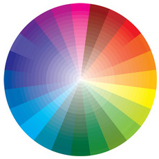
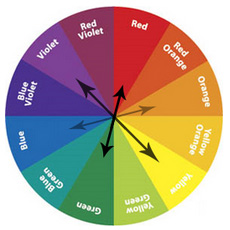
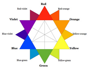
Colour and feelings are synonymous in stimulating us on a visual level. Colour categories comprise warm (red, yellow, orange), cool (blue, green, purple) and neutral (brown, grey) groups. The general consensus for colours associated with perceptions are as follows:
- Blue: relaxation, knowledge, power, seriousness, expertise, peaceful, depression, masculinity
- Red: passion, rage, confidence
- Yellow: happiness, brightness, optimism
- Orange: energy, joy, deceit
- Green: envy, health, growth, harmony, money, environment
- Purple: royalty, luxury, spirituality, gloominess
- Black: authority, sophistication, sorrow, mystery, elegance
- White: purity, innocence, clean
- Grey: conservative, professional, reliability
- Brown: comfort, stability, nature
- Gold: prestige, illumination
- Silver: glamorous, industrial
- Copper: money goals, career moves
- Beige: sophistication, neatness
- Pink: romance, femininity, nurturing
However, cultural diversity means that the symbolism of colours can vary in different countries. This is also subjective in terms of gender, age, class and trends.
Also white is commonly used to fill up the empty space in website design. Recognised as ‘white space’, it is not necessarily white but a colour that fills up the difference between negative and positive space. http://webdesign.about.com/od/webdesignbasics/a/whitespace.htm
Another useful tool for website designers is contrast ratio. This highlights the difference between the text and the background or foreground. The ratio of contrast is beneficial for those who are colour blind. http://gmazzocato.altervista.org/colorwheel/wheel.php
The vast array of hues and saturation of colours are so powerful that they are also used for healing purposes. “Colour is simply light of varying wavelengths / frequencies and, as such, is a form of energy that is used in Colour Therapy.“ http://www.colourtherapyhealing.com/
- Magenta: change
- Violet: dignity
- Blue: calmness
- Turquoise: immunity
- Green: balance
- Yellow: detachment
- Orange: joy
- Red: energy
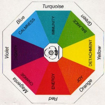
Colour elicits a sensory experience and as such is highly relevant to graphic design, as demonstrated by some of our websites below:
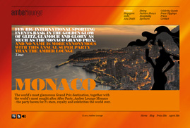
Amber Lounge
The main colours implemented are orange, yellow and red. This exudes energy, joy, happiness, brightness, passion and confidence to create a positive ambience. Although it is a bold statement, the black and grey colour accents provide a sophisticated, elegant and professional edge to the site.
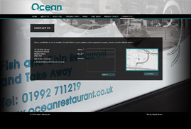
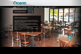
Ocean
Black is the central colour applied to enhance the elegant and sophisticated overall appearance of this business. In juxtaposition, turquoise (blue/green) is adopted to represent the ocean and signify an atmosphere of relaxation, expertise, knowledge and harmony.
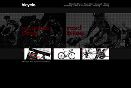
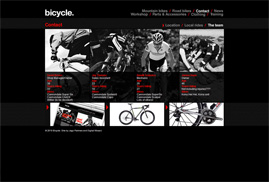
Bicycle Richmond
The themed colours here are black, grey and red. Again, this empahises an organisation that is sophisticated, elegant, professional, confident and reliable.
Article written by
