Golden Ratio in Web Design
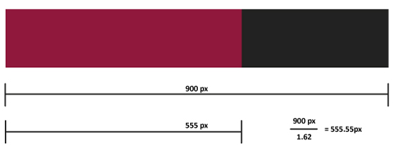
The Golden Ratio otherwise known as the divine proportion, is a calculation for perfection creating symmetry in maths and art etc. It is often represented by the Greek letter F (Phi), which is an abbreviation for the mean of Phidias (an Ancient Greek sculptor, painter and architect that applied this equation to his work, most notably the Parthenon). The mathematical irrational constant is 1.6180339887 and its common ratio is 1.62 or 1.618. In design, the application of this magic number produces visible appeal by ensuring that an image is aesthetically proportional.When building a website, the use of the golden ratio influences the grid format, enhancing its visual ideal. Arithmetics involved are as follows:

- Width of content area divided by 1.62.
- The remaining smaller number forms the sidebar column.
- Subtract the main column width from the whole width.
Similarly, the same principle can be employed to tally the width and height of the elements within the grid layout. To avoid enumerating every time, you can download http://960.gs/ that automatically divides your grid into thirds, transforming its aesthetic appeal.
Grids require a sense of structural harmony, order and balance. Additionally, they should provide a fluid composition that affords clarity and focus on usability. Utilising the golden proportion in your design effectively communicates your message. The golden ratio is based on the premise that it is omnipresent in nature and as we are subconsciously familiar with this, we are hardwired to find comfort in that which is visually compelling. Such perfectly equal dimensions can be found in naturally created designs like flowers, the nautilus shell, body parts etc. The same principle applies to man-made designs like the Mona Lisa, some of the Seven Wonders of the World and many more iconic images in architecture and art etc.
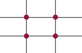
Some people find it cumbersome to calculate every graphic created in design with the ratio that denotes the divine sense of aesthetic. As such, they take shortcuts with the 5:3 ratio which is not the golden ratio however, is close. Dividing the composition of your design into thirds without a calculator can be executed as follows:
- 9 equal parts
- 2 equally spaced horizontal lines
- 2 equally spaced vertical lines
- The 4 points in the middle where your lines intersect are the hotspots for your website.
Therefore when planning your website layout, the strategic positioning of information within these hotspots draws attention to what is most valuable. In the rule of thirds, the left upper corner is often the strongest element. The grid is an essential tool for graphic design and encompasses the anatomy of a web page. The basic components include:
- Container
- Header:- logo and navigation
- Main content (two thirds)
- Sidebar (one third)
- Footer
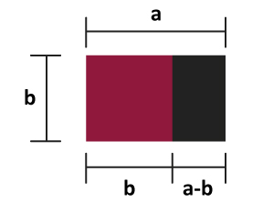
The divine proportion can also be applied to calculating the details within these elements such as captions on images, text surrounding images, advertising space and navigation. The golden ratio is also known as the golden rule, golden cut, golden section, golden mean, golden number and divine proportion. When this geometrical technique is applied to smaller sections, a golden rectangle can be created. This is achieved when the width of the sidebar is oriented vertically, a square is then cut off and a golden rectangle remains of equal proportions. In digital art, this can be applied to logos or smaller icons and mark off individual elements or widgets. E-commerce sites usually benefit from these formatted alignments. The golden rectangle is also present in snowflakes, which is another example of divine inspiration-hence the term divine proportion. This theorem arose from the Pythagorean observation of a mathematical pattern that frequently occurred in nature. Piet Mondrian-a Dutch painter that founded grid theory was influenced by the mathematical concepts of the Ancient Greeks, as were Renaissance artists who revived antiquity.

For free grid templates, download here:
http://designshack.co.uk/articles/css/free-960-gs-css-photography-template-and-tutorial
The golden ratio in web design merely serves as a guideline for designers to produce aesthetically pleasing websites. However, you do not have to abide by the rules of implementing these sizing heuristics if you find calculating every element, complicated. Instead it can be executed automatically for you via http://www.goldenratiocalculator.com/. Therefore, if you want to design a beautiful website that a user finds gratifying, you can use the golden ratio to create a golden layout.
