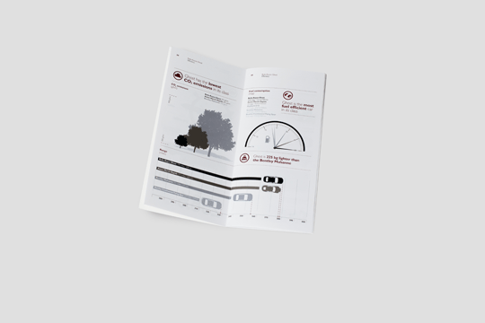
Infographics
April 29th, 2013
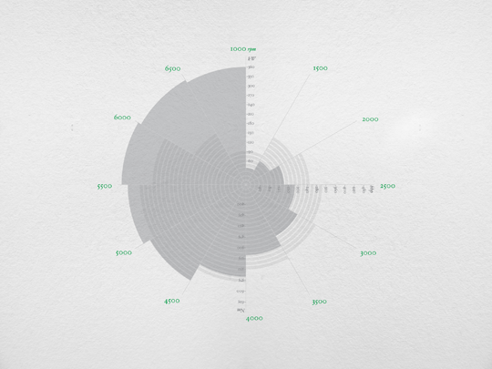
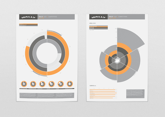
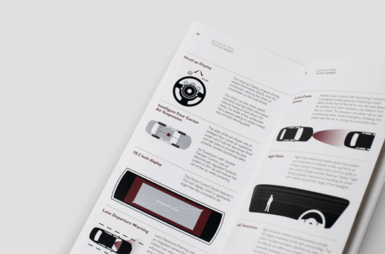
Infographics are bitesized parts of information that present complex data with clarity and brevity. Information graphics enhances users’ sense of familiarity with patterns or trends. The process that follows is known as data visualisation, information design or information architecture. Utilising infographics as a tool often includes statistics, graphs, pie charts, maps, schematics, grids, site plans and other relevant data. In the web industry it provides a helpful signage system or the integration of standardised icons, that offer visitors knowledge in a comprehensive yet simplified way.
These software solutions can convey educational information that is popular for digital campaigns and branding, on behalf of agencies, businesses and media organisations. Data visualisation is just one means of delivering information. On the other hand, infographics can take various routes to be displayed that are shaped by static, interactive or motion graphics. The outcome is usually the end result of intense research and concept development. Here is a free site that allows you to upload or create your own infographics, as well as view prior examples: http://infogr.am/
Infographics also provide online visual reports for social distribution based on content that show cases your company’s insightful marketed data. You can calculate your own pie charts to represent your business’ interests and statistics: http://digitalmarketingcalculator.com/
Infographics work for many subjects to portray any message intended, in fact most presentations are not complete without them. This can also include internet illustrations that make sense to users who require a breakdown of surveys conducted to monitor decline and growth. Information graphics enable the use of a single symbol to process information.
We are surrounded by infographics in many walks of life ranging from business meeting presentations, the weather, manuals, road signs, media, publications and any other means of illustrating information in a condensed form that would only appear convoluted as text. For daily concepts, information graphics represent a type of visual shorthand.
When visualising information in graphic design, it is important to honour the flow of data by giving it aesthetic form to counteract any abstraction. Making information look beautiful or easily understood is always an interesting challenge for graphic designers. Their skills are honed to solve problems creatively by communicating through visual language. This allows copious amounts of mundane data to become more accessible and engaging. With the current technological landscape, we have numerous data retrieving tools like sensors, gps systems, databases and social networking yottabytes of data that can be transformed into graphs or stylish visualisations instead of unimaginative diagrams.
Unlike pictures, infographics is recognised more as data-based art. Information visualisation is an indispensable instrument that implements the influx of manifold binary data which circumvents us. With every click on a website leaving a digital trace, we are at the mercy of recorded data in an information society. Infographics is an effective means of facilitating understanding for recipients. Function, aesthetic form and a narrative, enables readers to make sense of information. It then becomes subject to interpretation in a targeted way by focusing on data, designers and their clients want to highlight.
The discipline of graphic design includes being able to review, research, contextualise and analyse facts to purport a message. This also entails the:
- Data Process (the route the data takes to translate from values in a database to visual arrangements of information).
- Datablocks (the handling of data-stream by a computer program in blocks or sequences of bytes or bits).
- Datacurves (curved shapes often depicted in line charts or diagrams that look like wave results, eg. chronological data points resembling the economic climate).
- Datalogy (the study of data as a knowledgeable subject that focuses on the connection between data and identifiable symbols using analogies).
- Datanets (network structures that develop from connected data points via links and nodes, that are more informative than a single record of data).
- Datamaps (the process of creating data mappings between two distinct data models to integrate more data such as location co-ordinates, names, postal code, missing social security numbers etc. Additionally, to mediate between data source and destination, to execute database consolidation, to perform data lineage analysis identification and discovering hidden sensitive data).
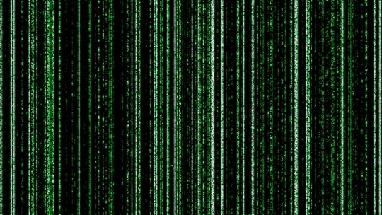
- Dataesthetic (the primary goal is of artistic expression that is emotive rather than merely to inform.) One good example of this was The Matrix Trilogy introduction that exhibited cascading green code fragments against a black backdrop. A powerful metaphorical infographic associated with computer data, yet designed for a mainstream purpose.
Overall, infographics allows obtuse data to be shaped for visual consumption whilst imparting useful information. The design process transforms the subject matter into an emotional and material output. Information graphics means that ‘seeing is understanding’, as opposed to the laborious process of deciphering masses of data. As Albert Einstein once said: “If you can’t explain it simply, you don’t understand it enough.”
Infographics is the visual communication of the complex variety of data that encompasses us but manages to combine complexity and simplicity simultaneously, to produce ‘simplexity’ for viewers. The evolution of infographics is demonstrated from cave paintings, to cartography, to informative images for web and print. With location, time, categories and hierarchy being influential factors in the visualisation of data – ideas, issues and knowledge become more meaningful in axiomatic summaries. Infographics are how designers help, to visualise data into bitesized graphics. If you consider that one byte is an 8 bit unit of digital information in computing, then you can remotely conceive how a compilation of bytes equates to manifold data, that graphic designers use to breakdown into explanatory imagery. This can be a complex process however, the end result for web visitors is a clear, pictorial metaphor for information.
Pictures by Mike Kramer (excluding Matrix image)
Article written by
