The London Olympic Logo 2012
July 25th, 2012
A logo or ideogram, is an emblem or graphic mark that represents and promotes the trademark or brand, of a company or individual. In graphic design, it is an important part of creating the corporate identity of commercial enterprises and forging their recognition. A logo is normally comprised of an icon or symbol, or the name of an organisation – a logotype or wordmark. Logotype developed from the times of hot metal typesetting, where a colophon or typeface was arranged in a unique way. To re-design a logo regularly is counterproductive, as fostering familiarity is the essence of its purpose. The design process of a logo, involves constructing the colours, format and theme to embody the brand’s values, concept and target their consumers. Other considerations include the psychology of symbols – how their shapes are interpreted in different cultures and how dynamic and internet-compatible the logo design is. One of the most prevalent logos being discussed currently is that of the 2012 Summer Olympic Games.
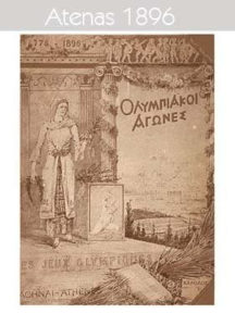
This year the Olympics are officially known as the Games of the XXX Olympiad taking place in London 2012, approximately 3,000 years on from those first recorded in 776 BC in Olympia, Greece. Subsequently Greece hosted the first modern Summer Olympic Games in 1896 and created the first logo that took precedence for others to follow.

Picture: shafprince.com
The evolution of logos from the original Olympic ideogram to that of The Summer Games 2016, is denoted as follows – including the London 2012 emblem. Evidently, the designs are heavily influenced by the artistic movement of their era and the cultural aesthetic preferences of the hosting city. The Summer Olympic Logos span between 1896-2016, where as the Winter Olympic Logos range from 1924-2014 and were first held in Chamonix, France in 1924. http://totallympics.com/forum.php?mod=viewthread&tid=2554
Noticeably, the Olympic rings have been incorporated in to all the logos from 1928 onwards. The five interlinked rings logo that has become associated with the Olympics globally, was designed in 1912 by Baron Pierre de Coubert. “The emblem chosen to illustrate and represent the world Congress of 1914…: five intertwined rings in different colours – blue, yellow, black, green, and red – are placed on the white field of the paper. These five rings represent the five parts of the world which now are won over to Olympism and willing to accept healthy competition.”
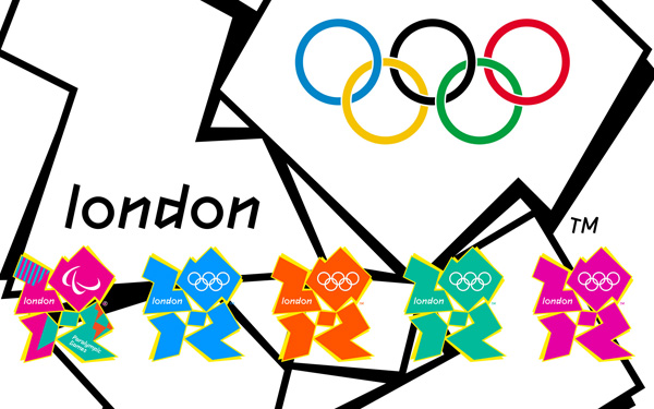
All the official Olympic logos spanning from 1896 to 2016 have and will, make their mark in history. However some are more memorable than others, in terms of design and public appeal. As the Olympics are being hosted by London this year, the 2012 logo is very topical and has sparked ambiguous reactions. It was designed by Wolff Olins and cost £400,000 including complex branding guidelines. It represents the actual number 2012 with the Olympic rings inserted within the zero. The motto behind this emblem is to “Inspire a Generation“, which it may not have achieved considering the response from the public via a poll on the BBC website. The feedback was 80% negative (8,150 out of 10,188 votes disliked it). Admittedly at first glance, the logo could be misconstrued for the abstract floor plan of a shopping mall. However, there does seem to be some rational thinking behind the logo that has consolidated the standard colours (blue, orange, green and magenta). Additionally, the colour scheme amalgamates that of the Olympic sponsors and includes elements of the Union Jack. Apparently, the colours are also inspired by the communications, fashion and media industries. Each colour variation of the logo is distinctly outlined with yellow, to supposedly symbolize an energetic buzz. Innovatively, the same ideogram is used to represent the Paralympics for the first time. Various complaints have been made regarding the symbolism of the design. Most notably, was Iran’s accusation of the logo spelling the word ‘Zion’. Although everyone appears to have an opinion on the quality of its visual appeal, especially for the astounding cost incurred, it has been created with the intention of becoming a brand rather than just a one-off logo.

Picture: hd-wallpapers.com
The jagged imagery utilised to create a contemporary feel, also seems to have filtered through to the bespoke typeface designed by Olin’s team and copyrighted as ‘2012 headline’. Combined with the primary font ‘Futura’ used for body copy, the typography complements the textual content – enhancing its legibility with dynamic lettering. As such, the logo has a more powerful impact than Johnston typeface used on Olympic tube maps and generally around London. For secondary text font in body copy – ‘Arial’ is used for online viewing and desk top printing, as it’s more readable. The palette utilised is influenced by the next generation of Londoners being perceived as energetic, spirited, bright and youthful. Brand consultants are also divided in their interpretation of the avant garde design. The transformation of shapes as a birds-eye view of the London boroughs, immersed in chromatic compositions, reinforce the theme of modernism. The number, text and image of the logo, defies traditionalist thinking in favour of a more neoteric approach.
The logo took a whole year to design, including other promotional material. The animated version online alternates between four colours to promote energy, inspiration and interest for London as a vibrant city with a diverse population, based on the theme of inclusion. The word ‘London’ in ‘2012bold’ font is purposely in lower case, to stress that although the games are being hosted in this city, they are for the UK and the rest of the world. Although having been accused of being discordant and illegible, Michael Hamilton of Branding consultants says: “People have long stopped reading logos. Another part of the brand kicks in because the brain says ‘I’ve seen it before’. It’s recognition of the shape, not the eligibility of the content. This logo will get that recognition and get that response in the brain.” The chairman of the London 2012 organising committee Lord Sebastian Coe justified the concept behind the design as “It’s not a logo, it’s a brand that will take us forward for the next five years….It won’t be to everybody’s taste immediately but it’s a brand that we genuinely believe can be a hard working brand which builds on pretty much everything we said in Singapore about reaching out and engaging young people, which is where our challenge is over the next five years….If we don’t do that, then frankly the whole project is unsustainable.”

Picture: bbc.co.uk
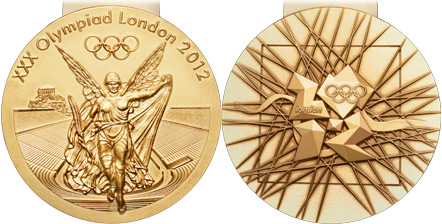
David Watkins – the designer of the Olympic medals, has placed the logo against a flexible grid of intersecting shards, indicating a sense of pulling together from around the world. This is also devised based on the Wolff Olins logo design, whose geometry is apparent in the branding of the London Olympic promotional material. The angles of the logo have a purpose that create focal points of 2012 and branch off in to patterns of adjoining lines reaching beyond London, illustrating unity. The style is reminiscent of Cubism, whereby the subject is abstractly re-assembled depicting multiple viewpoints to be represented in a greater context. The beauty of this design is that it’s detailed yet simplified, as exemplified by the River Thames, which is symbolised by a ribbon. The Greek Goddess of Victory-Nike, is depicted emerging from the Panathenaic Stadium to arrive in the host city. There are 4,700 medals in total being kept at the Tower of London. They were crafted in Llantrisant, Cardiff by The Royal Mint. The Paralympic medals were designed by jewellery artist – Lin Cheung.
Although there is a unique method behind the logo design, it has still been criticised by many for patronising the youth of today and not showcasing much relevance to the UK games. As there has been a mixed public reaction, is it a no-go logo or not? Perhaps the initial response has been unfavourable, however it may grow on the UK with time. The design whether aesthetically pleasing or not, is now instantly recognisable with the promotional efforts evident around London. If the London Olympics 2012 are supposed to “Inspire a generation“, it’s likely that it will with the positive meaning behind the Olympics anyway:-
The Olympic Motto: ‘Citius, Altius, Fortius’. This is Latin for ‘Faster, Higher, Stronger’.
The Paralympic Motto: ‘Spirit in motion’.
The Olympic Creed: ‘The most important thing in the Olympic Games is not to win but to take part, just as the most important thing in life is not the triumph but the struggle. The essential thing is not to have conquered but to have fought well.’
Yet whether the logo is able to do that or not, is another matter. Does it graphically capture the message it wishes to convey? – most would disagree. Is our initial instinctive negative response to the logo for a reason, that perhaps its representation is not what it seems? Or is it due to our contemporary tastes influenced by the artistic movement of our time, are still traditional and have not yet been challenged enough? Or the fact that prior Olympic logos have appeared far more superior? Or the public do not understand the thought process behind the brand? Either way – it’s here to stay until the next Olympics and despite what may first appear to be a basic design, actually a lot of thought has pervaded it as a brand with extensive semiotics involved.
Article written by