White Space
April 14th, 2011
White space is commonly regarded as negative space. Deriving from graphic design practice where white paper is often used during the printing process, it is the space on the page between markings and other formatting techniques such as text, margins, gutters, columns, figures and illustrations etc. It is important not to refer to white space as ‘blank’ as it creates balance between the positive or non-white space and the negative space. It showcases the existence of any objects within the composition of a website.
If there is too much content for a page, it appears cluttered and constrains reading. However leading and typeface overcome the problem of limited white space in printed advertising. Discerning use of white space affords designers pages that have a classic and elegant presentation eg. “less is more.” Alternatively, little consideration for white space can render a page incomplete. The display of white space in publications, compliments the use of various colours and textures on assorted papers. When the presentation of information is dense, it is less likely to be used for high end brands. Where as generous use of white space often correlates to luxury branding, as minimalism emphasises the product.
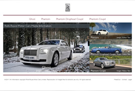
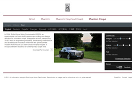
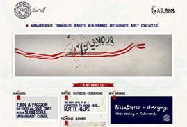
In web design, white space alleviates the elements within the layout, that are visually demanding. This enables the message conveyed to be more powerful. The following are just some examples of how white space is utilised in Digital Mosaic’s portfolio.
White space is divided into two types, being active and passive. Active white space is left unfilled intentionally to highlight content and structure. It leads the user from one feature to another. Passive white space is the by product of formatting and is the empty space between the content and outside of the page. There are twelve aspects of white space to consider, when designing.
- Space for further creativity
- White space is visually attractive
- People respond positively to white space
- Used to create a balanced and harmonious layout
- Increases appeal of layout
- Improved legibility
- Creates professional, sophisticated, elegant and clean designs
- Provides focus and emphasis to an object
- Directs the viewer’s eye
- Acts as a separator
- Signifies location, movement, importance, order and relationship between objects
- Creates groupings of elements
The composition of elements in graphic design is defined by ‘micro’ white space (the space between smaller elements) and ‘macro’ white space (the space between prime elements). Overall, white space is integral to design and not merely background. This principle is similar to the analogy of an old man who creates designs from visualising what remains, when everything else is removed. “I mean that I look for the elephants in the stone. When I can see them well, I carve away the stone to set the elephants free. Then everyone can see them.” Vashanti Rahaman (The man who could see elephants)
Article written by


