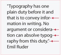
Chapter 4: Typography in Web Design – Hyphenation, Emphasis.
September 6th, 2011
Hyphenation Hyphenation in typography serves to connect words that are divided when they cannot fit comfortably at the end of typed lines. To avoid fragmented words, hyphens should be placed predominantly between consonants. A useful tip is to ensure that a hyphen is sandwiched between two letters on one line and three on the following line. Emphasis Emphasis is a […]

Chapter 3: Typography in Web Design – Kerning, Tracking, Baseline, Leading.
September 6th, 2011
Kerning/Mortising, Negative/Positive Spacing-Tracking Kerning-also known as mortising, adjusts character spacing in proportional fonts for an aesthetically pleasing result. This is achieved via moving the letters closer together, otherwise referred to as negative spacing. Tracking or positive spacing on the other hand, moves the letters further apart. When a font is kerned correctly, the area of the two-dimensional blank spaces between each pair […]

Chapter 2: Typography in Web Design – Space, Widows & Orphans, Alignment, Paragraphs, Measure.
September 6th, 2011
Space Allow your text to speak by having enough negative or white space to envelope it. Another web typography rule is to keep 140% of line spacing in relation to your font size, as specified by the line-height CSS property. In fact the attention to micro space within the type, is the mark of a good designer. Not only is […]

Chapter 1: Typography in Web Design – Contrast, Font Size & Hierarchy
September 6th, 2011
Typography derives from the Greek words ‘typos’ and ‘graphe’, meaning ‘form’ and ‘writing’. In web design it is the technique and art of arranging typefaces, which manifested when Tim Berners-Lee launched the first website in 1991. http://www.telegraph.co.uk/news/newstopics/ nationaltreasures/2194133/Sir-Tim-Berners-Lee-portrait.html Contrast The contrast between typography and background requires consideration of colour and font types. The purpose of text is to be perused […]
HTML5 Videos
August 1st, 2011
HTML5 video is a movie and video playing element within HTML5, somewhat replacing the object element. This is due to the on-going evolution of support for the video element. As such a standard way has been adopted, to embed video into a web page. Prior to this, the majority of on-line videos had been channelled via third party plug-ins. Flash […]
Soccerscout USA
July 25th, 2011
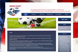
Digital Mosaic launched the Soccerscout USA website to further the careers of nationwide footballers in the States. We tried out for the team but took the dribbling too far, when we spotted the manager eating biscuits from the sidelines. ;o)

ETS Website
July 22nd, 2011
Digital Mosaic present their re-vamped website for ETS-Electromagnetic Testing Services company. Luckily our director’s cybernetic leg slipped under their radar. ;o)
The London Daily News
July 21st, 2011
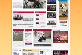
Digital Mosaic have recently re-designed the website for The London Daily News, keeping readers informed with the latest headlines. Thanks to their on-line broadcasts, many trees have survived the curse of printed paper. ;o)
