Love Moi Boutique
June 10th, 2013
We designed the logo and image banners for Love Moi Boutique’s new accessories website. We fashioned this stylish e-commerce store with an artistic and symbolic approach to highlight three individual jewellery collections. What better way to shine in life than by wearing sparkly adornments.
Article written by
LGR London Greek Radio 103.3 fm App
April 4th, 2013
We created the new LGR app (London Greek Radio 103.3 fm) to keep in line with their updated branding we designed for their website, several print projects and logo. This is also unified with their social media feeds. Now the Greek community’s number one music station has moved with the times and is available on iPhones and iPads. From airwaves […]
Article written by

How Has The Web Changed Business Positively?
September 19th, 2012
Over the years, the World Wide Web has become the most desirable tool in the work environment, changing the way business is practised. It connects others with ease instantaneously, in ways that include accessibility and cost effectiveness. The web has not only revolutionised business but also homes, education services, libraries, internet cafes, hotels, hospitals, banks, the entertainment industries, the […]
Article written by
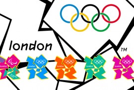
The London Olympic Logo 2012
July 25th, 2012
A logo or ideogram, is an emblem or graphic mark that represents and promotes the trademark or brand, of a company or individual. In graphic design, it is an important part of creating the corporate identity of commercial enterprises and forging their recognition. A logo is normally comprised of an icon or symbol, or the name of an organisation – […]
Article written by

What clients need to consider when commissioning a website
March 29th, 2012
When requesting a website, there are numerous factors that require consideration for its creation. It is important to communicate your specification to the designers and developers, to avoid incurring any additional charges and maximise time productivity. Websites can take weeks to build, so ensure you clarify your prerequisites during your consultation. Together, clients and the design team process can transform […]
Article written by
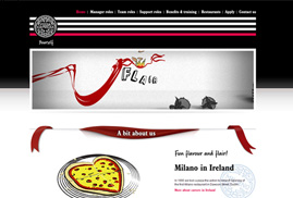
Pizza Express Yourself Rebrand
March 20th, 2012
Incorporating a fun and practical online recruitment service for Pizza Express, we created a website that fits within their brand guidelines. Therefore, since they say “a leopard never changes it’s spots”, we stuck to stripes, as Zebras do not have that reputation. ;o)
Article written by
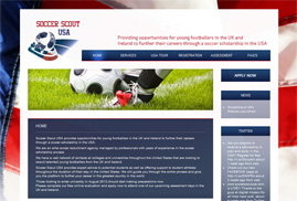
Soccerscout USA
July 25th, 2011
Digital Mosaic launched the Soccerscout USA website to further the careers of nationwide footballers in the States. We tried out for the team but took the dribbling too far, when we spotted the manager eating biscuits from the sidelines. ;o)
Article written by
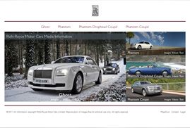
White Space
April 14th, 2011
White space is commonly regarded as negative space. Deriving from graphic design practice where white paper is often used during the printing process, it is the space on the page between markings and other formatting techniques such as text, margins, gutters, columns, figures and illustrations etc. It is important not to refer to white space as ‘blank’ as it creates […]
Article written by
Secret Santa
December 1st, 2010
Organising a secret santa this year? Here is a really simple website which gives you the option of leaving hints so you’re not left with an unwanted present! Check it out & feel free to share! https://www.digital-mosaic.co.uk/secret-santa/
Article written by
Ocean Restaurant Branded
November 8th, 2010
A new take on the traditional fish and chip restaurant is opening and we have branded it up to give a contemporary and classy feel. Yipeee free fish and chips for Digital Mosaic! Show me more…
Article written by